



 Updated
Stock trading charts or stock price charts are a fundamental tool that every investor should be familiar with. Here’s a quick guide explaining how to read a stock trading chart, and stock chart terms and patterns to know.
What Is a Stock Trading Chart?
A stock chart is a fundamental tool that visualises the price movement of a stock over time. Whether you are a beginner or a seasoned investor, reading a stock chart is essential for identifying market trends and making informed decisions.
At its most basic, a stock price chart is comprised of three main components:
- The X-axis: The horizontal line that denotes time.
- The Y-axis: The vertical line that denotes price.
- The Trend Line: The visual representation of the stock’s movement.
While a simple trade chart might just show a line, you will likely come across various types of stock trading charts, such as bar charts or candlestick charts, which offer more sophisticated data points.e
Depending on the platform you use, you may find other useful information alongside the graph, such as market cap, trading volume, dividends, and the P/E ratio. These data points provide context for the visual data.
Advanced platforms like TradingView allow for even deeper analysis. They enable you to compare multiple stock price charts simultaneously and use drawing tools to spot specific stock trading chart patterns. These patterns help investors evaluate the strength of a trend and predict potential future movements.
Reading A Stock Chart
Stock charts are ubiquitous, and anyone can look up a stock price chart at any time. For instance, here’s a stock chart from Google Finance.
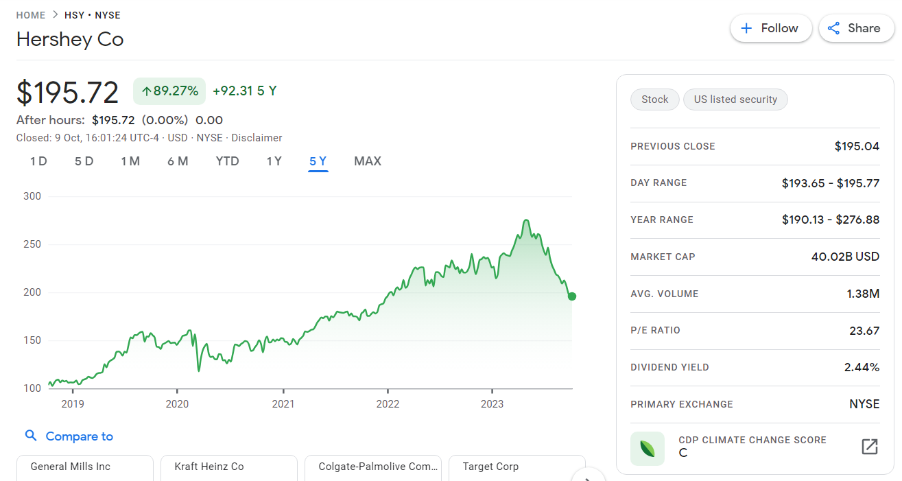
In the top left corner, we see the name of the company (Hershey Co) and also the ticker symbol (HSY). NYSE here denotes where the stock is listed, in this case, the New York Stock Exchange.
Just below the name is the price of the stock, which is US$195.72 at the time of writing. Next to it is the gain/loss, which changes according to the time period used for comparison. This is the first step in reading a stock chart: understanding the current value versus historical context.
In this case, notice that the time period is set to 5 years (5Y), and +89.72% in green is seen next to the price. This means that the current stock price of Hershey is 89.72% higher than it was 5 years ago. You can select different time periods ranging from one day to a maximum to see how the current price compares.
Visualising the Trends
The squiggly line in green is a visual representation of the price movement during the five years. While sophisticated stock trading charts might use candlesticks, this simple price line changes as you select different time periods for comparison.
To the right of the trade chart, Google has provided additional information regarding the stock. This includes price information such as the previous closing price, the one-day range, and the one-year range. Also included are other information such as market cap, P/E ratio, and more.
As you can see, stock charts are fairly intuitive and easy to read, so don’t be afraid to look up your favourite stocks on Google to familiarise yourself with them. You’ll also find earnings figures and other essential information about the company further down the page.
Types of Stock Trading Charts
Google Finance uses a simple line drawing to represent price levels, but there are other ways to visualise data on a stock price chart. Let’s take a closer look at the differences between the three main types: line charts, bar charts, and candlestick charts.
Line chart
Reading a stock chart often starts here. Line charts use a single line to plot the price of a stock over time. It is the simplest of the three and is often used to have share charts explained to beginners because it clearly illustrates the general trend and the closing price of each period. They are best suited for getting an overview of a stock’s price movements.
Bar chart
In more detailed stock trading charts, such as the bar chart, each trading period is represented by a single vertical line with short horizontal lines near the top and bottom.
Here’s how a single bar looks.
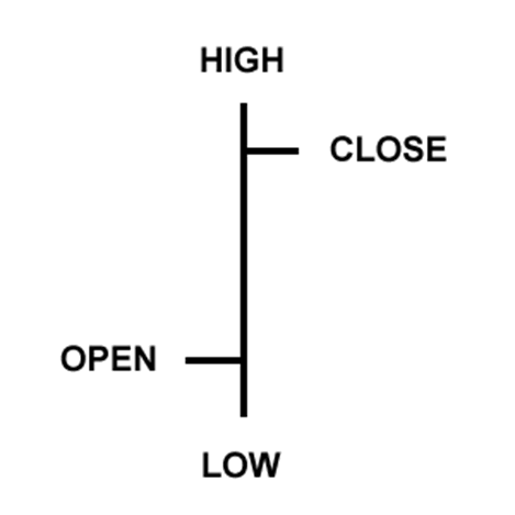
Each of the four points of the bar represents a piece of price information, as follows:
- High: The highest price of the stock during the trading period
- Low: The lowest price of the stock during the trading period
- Open: The price of the stock at the start of trading
- Close: The price of the stock at the end of trading
Between these four data points, a bar chart can tell us things like price volatility (the length of the vertical line) and market sentiment (the distance between Open and Close).
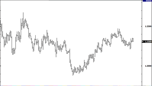
Of course, a chart doesn’t just consist of one single bar. Much like a line chart, these stock price charts indicate trends but provide a much more granular level of information regarding price action. It is made up of several bars lined up in succession, resulting in something like this:
Candlestick chart
Bar charts are great, but not necessarily the easiest to read compared to the candlestick chart. You may think of this as an “evolution” of the bar chart.
Instead of simple lines, candlestick charts are made up of solid bars (the body) with vertical lines (the shadow or wicks) above and below. The body is colored to distinguish whether the stock price ended the day up or down.
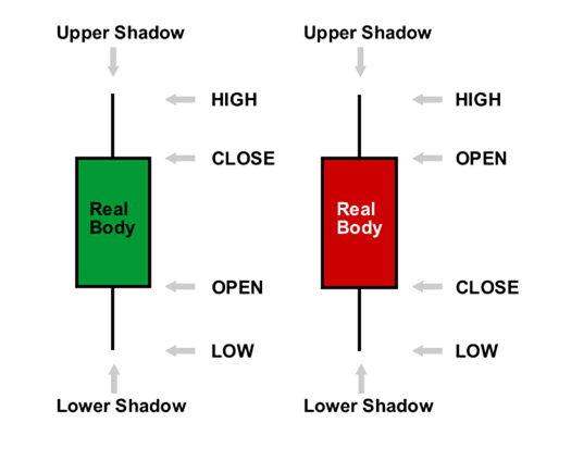
Similar to bar charts, they offer four data points: High, Low, Open, and Close. Additionally, a green candlestick indicates the stock ended the day with a higher price, while a red one denotes the reverse.
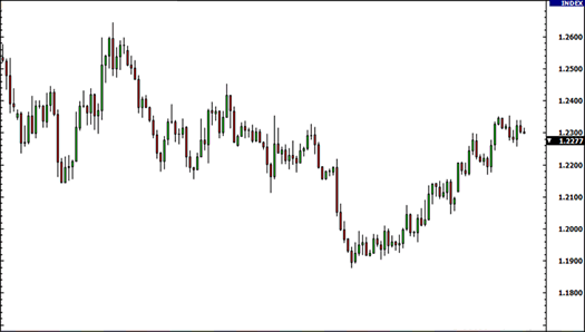
As you can see from the example above, candlestick charts are able to convey more information while remaining highly readable. This clarity is why they are the most popular format for traders looking to spot specific stock trading chart patterns that predict future movement.
Stock Trading Chart Terms to Know
Now that you understand the basics of reading a stock chart, let’s discuss some common terms you are likely to encounter.
Market cap
Short for “market capitalisation”, this is the total value of a company’s stocks and shares. The formula is as follows:
Market Cap = Current Share Price X Total Number of Outstanding Shares
Market capitalisation is also used as shorthand for the size of a company. Apple is considered a giant in the tech industry, not because of its workforce but because of its trillion-dollar market cap.
P/E Ratio
The Price-to-Earnings (P/E) ratio is one of the first things many investors check to gauge whether a stock is worth its current price tag. Here’s how to calculate it:
P/E ratio = Stock Price/Earnings Per Share
Now, you might be wondering:
“What is considered a ‘good’ P/E ratio?”
There is no standard P/E Ratio that is universally positive or negative. Rather, a stock’s P/E Ratio should be considered in the context of its sector. You have to ask: how high or low is it compared to its peers?
Generally speaking, growth stocks tend to have higher P/E Ratios, whereas value stocks tend to have lower ones—but exceptions are always possible.
Dividend yield
Many, but not all, companies share their profits with shareholders in the form of dividends. The formula for it is:
Dividend Yield = Dividend Per Share/ Stock Price x 100%
For instance, if ABC Inc. declares dividends of US$2 for the year, you will be paid US$2 for every share you hold. Rather than the dollar amount, stock charts indicate dividend yield instead.
Dividend yields are a massive consideration for income-focused investors. A dividend yield that increases at a reasonable rate is often seen as a reliable sign of a healthy, generous company.
Average volume
Average volume refers to the trading volume of a stock, which indicates the number of shares traded during a specific period.
Here is why this is critical:
This metric helps you gauge the liquidity of the stock. When average volume changes drastically within a short time, it signals high volatility. It means stocks are switching hands at a furious pace, which often precedes a major price move.
Primary exchange
This simply indicates the country or marketplace where the stock is listed.
This location impacts trading hours and tax obligations. For example, if a stock is listed on the New York Stock Exchange (NYSE), you would have to follow NYSE trading hours to trade the stock, regardless of where you are in the world.
This Is Just the Beginning of Reading A Stock Chart
In this article, we’ve explained the basic components of stocks charts as well as some common terms. Hopefully what was once a mess of lines and numbers has now become much more comprehensible.
You can further increase your skills with stock charts by looking up chart patterns and charting tools. Incidentally, knowing how to read stock charts is a core skill in technical analysis, so you’ll be building your foundational skills as you learn more.
Mastering the art of reading a stock chart is more than just a skill—it is your passport to the financial markets.
Think about it:
Whether you are glancing at a simple trade chart to check a price or analysing complex stock trading charts to spot a breakout, these visuals are the language of the market.
There is still so much more to uncover. Beyond the basics, advanced investors rely on recognising specific stock trading chart patterns—like head and shoulders, bull flag, and pennants—to predict future movements with greater accuracy.
Ready to dig deeper?
To truly master the markets, you need to continue your education. Visit Vantage Academy to explore our library of articles, where we dive into advanced stock price charts, technical indicators, and trading strategies designed to sharpen your edge.
Start learning with Vantage today, and once you are ready, open a Demo or Live account, and turn those charts into opportunities.